In this short guide, we'll go over the CSS overflow property and I'll show you how to prevent a scroll bar from appearing anywhere around your container element even when content flows beyond it.
Before we start: Affiliate marketing is currently one of the easiest ways to make money online. To get started, check out the 72IG WhatsApp income generator training which teaches you how to make money doing Affiliate Marketing. Check out the course here.
What is an Overflow?
Sometimes when you are styling a website, the content may fail to fit into the borders of the container that you give it. In other words, it flows out of its container.

When this happens, you can either make it fit or cut it off. If we want to cut it off, this is where the overflow property comes into action.
CSS overflow allows us to show, hide or scroll the content of an element.
Important Note: The overflow property only works when an element is a block element and it has a defined height. So you need those two things for the overflow property to work.
Let me explain with some code examples.
HTML and CSS Code
In the HTML we have a div with a class aptly named container.
<!DOCTYPE html>
<html lang="en">
<head>
  <meta charset="UTF-8">
  <meta http-equiv="X-UA-Compatible" content="IE=edge">
  <meta name="viewport" content="width=device-width, initial-scale=1.0">
  <title>Document</title>
  <link rel="stylesheet" href="style.css">
</head>
<body>
   <div class="container">
     Lorem, ipsum dolor sit amet consectetur adipisicing elit. Reprehenderit veniam, laborum voluptas repellat dolorem quas sit ut odio pariatur, delectus cumque voluptates id dolor at ullam facilis? Animi, officia sunt mollitia dolorem reiciendis impedit enim voluptatibus beatae labore consequuntur rerum! Molestias eaque dolore veniam laboriosam voluptatibus officiis quos, incidunt tenetur.

     Lorem, ipsum dolor sit amet consectetur adipisicing elit. Reprehenderit veniam, laborum voluptas repellat dolorem quas sit ut odio pariatur, delectus cumque voluptates id dolor at ullam facilis? Animi, officia sunt mollitia dolorem reiciendis impedit enim voluptatibus beatae labore consequuntur rerum! Molestias eaque dolore veniam laboriosam voluptatibus officiis quos, incidunt tenetur.
   </div>
</body>
</html>
The container contains two paragraphs of Lorem placeholder text.
Now we'll modify our style.css file and include the following styles:
body {
  margin: 0;
  font-size: 30px;
  height: 100vh;
  display: grid;
  place-items: center;
}

.container {
  width: 70%;
  color: gray;
  background-color: black;
}
For the body, we're removing all margins, setting the font size to 30px, setting the width and aligning its content in a grid position.
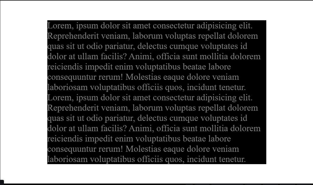
For the text container, we set the width to 70 per cent of its parent (body), set the text colour to grey and set the background colour to black.
Here's the preview at this point:

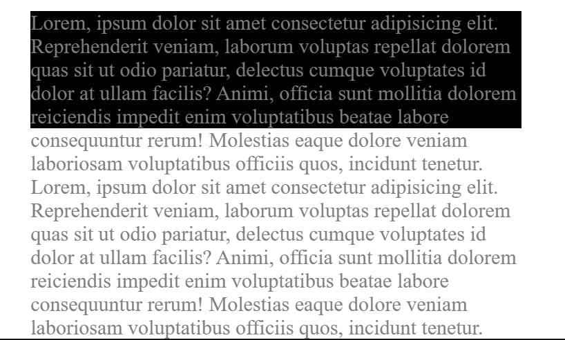
Now, normally a box will adjust its height automatically to fit the content within itself. However, if we set a height, and then the content is bigger than the container itself, then the content will overflow.
To demonstrate, let's add a height to our .container class rule block inside style.css:
height: 170px;
Here's the result:

As you can see from the image above, the container now has a height of 170px. However, the content itself is flowing out of the container. Given the problem, let's begin to explore the overflow property.
CSS Overflow values
visible
The first value is visible, and we're adding it to our .container block:
overflow: visible;
This allows the overflow content to flow past the container and be visible. For content overflows the container, CSS defaults to visible. That explains why our content went beyond our container even without an overflow property in CSS.
hidden
The second value is hidden. Now let's change the value of our overflow property to hidden in the style block for .container:
overflow: hidden;

This clips the content and hides the overflow. Note that the content itself is still there on the page, it's just not shown.
scroll
Next, we have the value scroll. Let's change our overflow from hidden to scroll in the style block for .container:
overflow: hidden;

As you can see, the overflow content is still hidden, and in addition, a scroll bar was added to both the x and y axis of the container so that we can see the rest of the content by scrolling.
Now even though there is no content to scroll left or right, if we want to show to scroll bar only for the y-axis (i.e vertical axis), we can change the overflow to overflow-y
overflow-y: scroll;

Now we can see there's no more scroll bar on the bottom.
There's also an overflow-x and as you might have guessed, this does the opposite of overflow-y.
auto
Finally, we have auto. This will add a scroll bar automatically, however, that is only if there is content that overflows.
So if we set our overflow to auto for our container element:
overflow: auto;
And we go back to our HTML and delete half of our text and save the file, we'll get the following.

We can see that our scroll bar disappears. If we bring back the text, then our scroll bar reappears.
Now in these examples we've only been using text, but the same thing applies when you're dealing with images as well. So if you have a really large image and a smaller container, and you set overflow to hidden on the container then the parts of the image which are overflowing will be cut of.
And that is overflow in a nutshell. I hope you learn something useful from this.
If you have any questions on this topic, please let me know in the comments.
Thanks for reading and do have a great weekend.

